

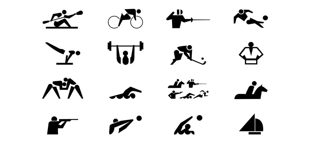
The invention of pictograms at the Tokyo 1964 Games heralded a major change in graphic design, and the creator of Tokyo 2020’s kinetic pictograms is hoping for something similar. The links tying the historic Olympic Games Tokyo 1964 to their modern 2020 counterpart are everywhere, and none more so than through the two sets of instantly recognisable pictograms. These small, invaluable graphics made their worldwide debut 57 years ago in the Japanese capital, and it’s no surprise that the two people tasked with designing the modern versions cast their eyes back towards their forefathers. “I have worked on this project as if I had received a baton to inherit our tradition and pass on to the next generation,” said Kota Iguchi, designer of the kinetic pictograms which will add a 21st century twist to the genre. Pictograms were invented under the watch of Tokyo 1964 artistic director Katsumi Masaru, as a non-verbal means of communicating to the mass of foreigners expected to arrive in Japan for the nation’s first Olympic Games. The figures illustrating men’s and women’s toilets came first, and the simple, instantly understandable design was applied to sports, using photographs as a background. It was a masterstroke, and the concept has been used not only at all the Olympic Games since, but all over the world. Iguchi, a motion graphics specialist, has been as much in love with the designs as anyone. “Static sports pictograms were first introduced at the Tokyo 1964 Games, and are said to be created from the idea of communicating through emojis instead of an alphabet, because the alphabet wasn’t widely used in Japan back then,” Iguchi explained. “I can empathise with this type of idea as it is a typical Japanese way of thinking. “And when I applied the idea to today’s world, I thought the idea of kinetic pictograms was a natural process.” In order to get the pictograms moving, Iguchi needed a 2020 static design upon which to work. Up stepped local designer Masaaki Hiromura. He too had no intention of straying far from the example set back in 1964. “I sensed not only simplicity, but also a glorification of each sport and the genuine enjoyment of sport in the design. I found that Japanese simplicity and minimalism had an affinity with my design, and I wanted to inherit that philosophy,” Hiromura confirmed. “Like the 1964 designs, we too ended up with the idea of creating a design to let people feel a pure joy of sport and the excitement of competition, rather than just making it look neat and tidy.” It was a masterstroke, and the concept has been used not only at all the Olympic Games since, but all over the world. Iguchi, a motion graphics specialist, has been as much in love with the designs as anyone. “Static sports pictograms were first introduced at the Tokyo 1964 Games, and are said to be created from the idea of communicating through emojis instead of an alphabet, because the alphabet wasn’t widely used in Japan back then,” Iguchi explained. “I can empathise with this type of idea as it is a typical Japanese way of thinking. “And when I applied the idea to today’s world, I thought the idea of kinetic pictograms was a natural process.” “I hope that kinetic pictograms will be created again by the local people in the next Summer Games in Paris, and the LA Games in 2028 and beyond,” Iguchi said, before adding: “The kinetic pictogram was already created by the local creator for the Beijing 2022 Winter Games. “If people all over the world continue to pass the baton to others like this, this new challenge that Japan initiated in 2020 will be inherited forever. It’s fun just to imagine whether the Paris pictogram moves will emphasise the beauty of the city, as Paris always does, or whether Los Angeles will create something quite entertaining like our general image of America. I’m excited to know.” AsiaFitnessToday.com features daily updates on the Tokyo 2020 Olympics. Source: PRNewsGIG/AFTNN/IOC
Kinetic Sports Pictogram
1 post